
In our constantly connected world, the importance of having a mobile-friendly website cannot be overstated. As of the second quarter of 2021, mobile devices accounted for over half of all web traffic worldwide. It’s clear that consumers are increasingly turning to their smartphones for browsing, shopping, and much more. This shift in user behavior makes mobile responsiveness more crucial than ever.
What Is Responsive Web Design?
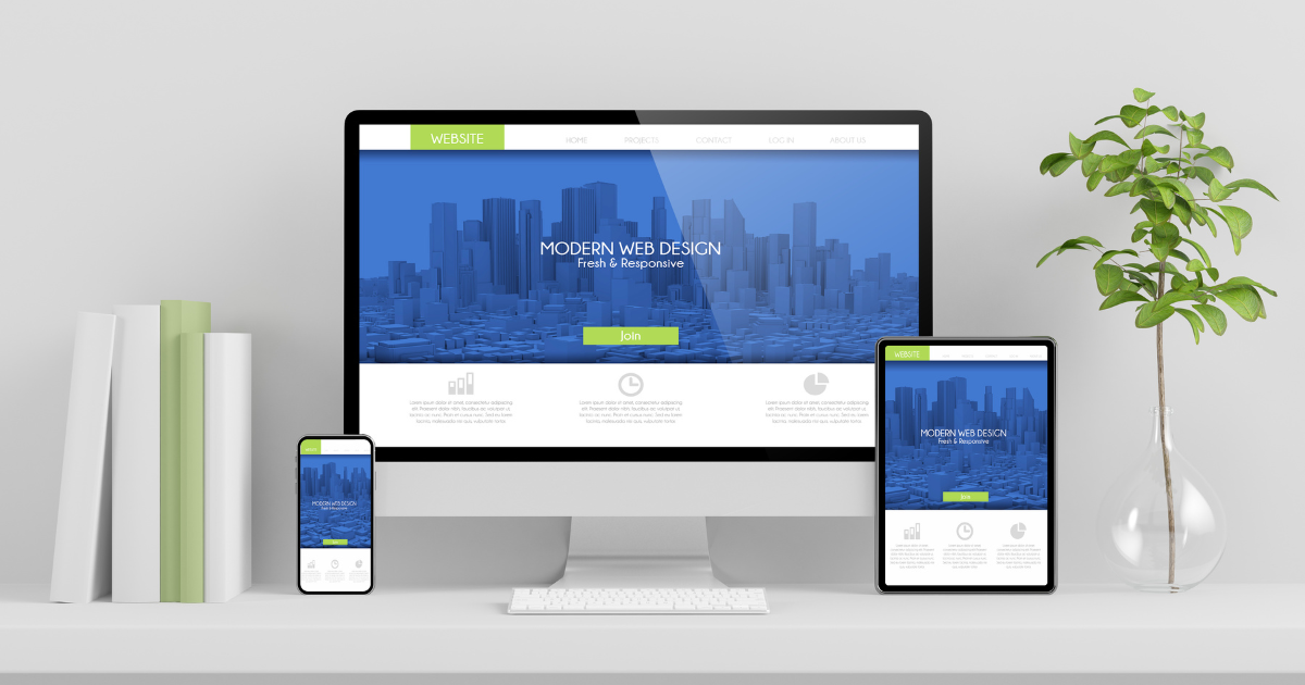
Responsive web design is an approach to web design that makes your website look good and function well on all devices, from desktops and laptops to tablets and smartphones. It automatically adjusts the layout, images, and functionalities of your website based on the device being used, providing an optimal user experience.
Why Is Responsive Web Design Important?
The benefits of responsive web design are multi-faceted:
Improved User Experience: A responsive website provides a seamless experience, whether a visitor is viewing your site on a 27-inch desktop monitor or a 5-inch smartphone screen. This seamless experience can significantly improve user engagement and satisfaction.
Better Search Engine Rankings: Google and other search engines reward mobile-friendly websites with higher rankings in search results. By optimizing your website for mobile, you’re not just enhancing user experience—you’re also boosting your SEO.
Increased Conversion Rates: When your website is easy to navigate and looks great on all devices, visitors are more likely to stay longer, explore more and take the desired actions, such as making a purchase or filling out a contact form.
Future-Proofing Your Website: Technology and consumer behavior are continually evolving. By implementing responsive web design, you’re preparing your website to adapt to future changes and trends.
How Vision Fillers Can Help
Designing a responsive website requires knowledge of both design principles and technical considerations. At Vision Fillers, we have a team of experts who specialize in creating mobile-responsive websites that not only look great but also perform well on all devices.
Our team will work with you to understand your business needs and design a website that provides a fantastic user experience, regardless of the device your customers are using. We also ensure your site is SEO-friendly to increase visibility in search results and drive more organic traffic.
In the mobile age, having a responsive website isn’t just an option—it’s a necessity. Don’t let your business fall behind. Contact Vision Fillers today to discuss how we can create a mobile-responsive site that takes your business to the next level.